
Section 7: How Can I Present My Evaluation Findings Effectively?
In this section:
An evaluation is only useful if its findings are clearly communicated to stakeholders and audiences that are in a position to influence the program's directions. It is important to communicate those findings clearly and accurately. Evaluation findings can and should be presented in three different ways:
- A narrative of the findings and the kinds of answers they give to the evaluation questions, with a discussion of the implications
- An objective display of the findings, including the quantitative findings, so that an interested person can draw his or her own conclusions about them
- Tables and graphs that visually communicate findings
Tables
Tables are objective displays of statistical output. They summarize such things as means and frequency counts according to student characteristics such as language group, grade level, number of years in program, SES, etc.
For an example, think back to the sample analysis in Section 6. You will be able to use the output of that analysis to create a table displaying mean (average) scores, something like this:
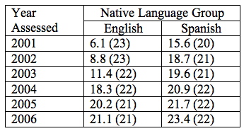
Table 1. Annual Spanish SOLOM Averages for English and Spanish Speakers
 HINT. What information should go in a table and/or its title? Be sure you provide enough information so that your reader knows:
- The outcome measure (test, survey instrument)
- The type of score (mean, percentile, NCE, scale score)
- Which groups are included in the table (all students, ELLs, EPs)
The numbers in parentheses refers to the number of students who had Spanish SOLOM scores for that year. Note that the numbers varied somewhat from year to year. Those variations should be explained in the narrative. The numbers for native English speakers declined slightly, and that could be explained by program attrition. The numbers for native Spanish speakers rose slightly, and that could be explained by the addition of new Spanish speakers in an effort to maintain balance between the groups. The narrative could also explain that it is difficult to add English speakers in upper grades because few native English speakers could enter those grades with enough Spanish to manage the grade-level curriculum. In contrast, many native Spanish speakers are sufficiently bilingual to manage the demands of English at those grade levels.
We have emphasized the importance of longitudinal analysis to demonstrate program effects. Therefore, the data in tables such as the one above should be culled to reflect students continuously served so that their scores would truly show program effects. The step-by-step explanation in Section 9 gives ideas on how to do this.
Tables that display averages are easy on the reader because one number, the mean, represents a whole group of scores.
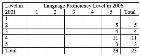
Scores in the form of performance categories cannot be averaged, as we explained in Section 6. They can only be tallied, and they show the reader many more numbers. The tables below are constructed from the example of language proficiency levels in Section 6. They compare Spanish SOLOM scores between 2001 and 2006 for both language groups—first for English speakers and then for Spanish speakers.
Table 2. Spanish SOLOM Scores for English Speakers—Scores Shown in Language Proficiency Levels
Note that most of the cells in this table are blank. It would be tempting to delete those blank cells, and the table would still present accurate data. On the other hand, the table as presented makes the visual statement that in 2001, none of the English speakers scored above level 3, and in 2006, none of them scored below level 4.
Similarly, the following table on Spanish SOLOM scores for Spanish speakers makes the clear visual statement that none of those students scored below level 5 at the end of that six-year period from 2001 to 2006.
Table 3. Spanish SOLOM Scores for Spanish Speakers—Scores Shown in Language Proficiency Levels
Tables of statistics and numbers present objective quantitative data for the reader to inspect. However, they still consist of a lot of numbers that may not readily communicate much to a reader. That's where graphs come in.
Graphs: Pictures of Information
![]() If you don't know how to construct charts in PowerPoint, we will give you step-by-step instructions for typical charts in Section 9.
If you don't know how to construct charts in PowerPoint, we will give you step-by-step instructions for typical charts in Section 9.
Graphs are pictures of quantitative information. They summarize and present numerical data in a way that communicates a quick message to the reader's eye about what the data mean. They should supplement, not replace, more detailed tables.
There are many types of graphs, but a few of them serve most purposes in writing evaluation reports or presenting data to some audience, and those are:
- Line graphs
- Bar graphs
- Pie charts
Each is more appropriate for a certain kind of data.
Line graphs connect the dots, and those dots are the mean (average) values of different sets of data. The Spanish SOLOM averages in Table 1 are an example of that. The data in that table showed the average Spanish proficiency scores of students year to year from kindergarten through sixth grade, encompassing years 2001-2006. Line graphs are a particularly effective way of picturing changes over time. In dual language evaluation, the changes over time will generally be the performance of a cohort of program students from year to year, as in the table above. The line graph presents a readily understandable, visual picture of the information contained in all those numbers.
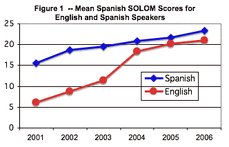
To repeat, line graphs lend themselves best to displaying changes in averages over time, whether of the same cohort of students, or different cohorts. The latter might be used to show gradual program improvement, e.g., the performance of 2003's third graders vs. 2004's third graders vs. 2005's third graders, etc., which enables you to determine whether program changes have resulted in continued improvement in student outcomes.
Since TWI programs serve at least two distinct student populations, separate graphs should represent the different groups. Just as the sample tables above distinguish between English speakers and Spanish speakers, it is often advisable to present the results of these groups separately. That way, the audience can focus on each group's progress rather than any disparity between the groups (which should diminish over time).
Although line graphs are typically used in program evaluation (and in staff meetings and board presentations) to represent average scores on a single measure over time, they can also be used to represent quantities, e.g., numbers of students enrolled. If your program has been growing significantly over the years, you might want to use a line graph to show that growth from year to year.
Bar graphs are appropriate for displaying quantities, usually numbers of people in groups, such as the numbers of students in different language groups, the numbers of students in performance levels, etc. Quantities, whether of people or commodities, are things that can be counted—one, two, three, etc. The bottom of a bar graph typically represents zero. The different bars on the bar graph represent the sub-groups of the total population that you want to display—numbers in language groups, numbers in performance categories, etc. The bars, then, represent the numbers of students.
The following bar graph illustrates the results for Tables 2 and 3 in Section 6.

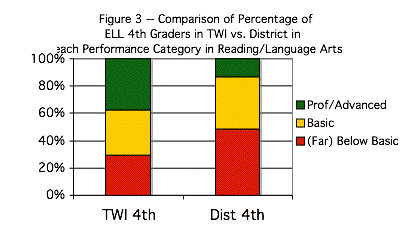
On these bar charts, the numbers in the left-hand column show percentages of students in increments of 20%, from 0% to 100%. The graph shows the percentage of students that scored as Proficient/Advanced, Basic, or Below Basic within each of the two groups of students—third and fourth grade TWIs in Figure 2 and fourth grade TWI vs. District in Figure 3.
Again, to repeat: Bar graphs best lend themselves to displaying quantities, i.e., numbers of people in given groups or categories.
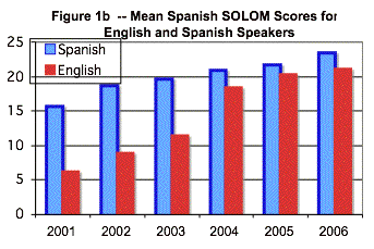
You will often see bar graphs used to represent test score averages, with the top of the bar corresponding to the average of the group the bar represents. Those graphs make their point, but they are a faulty picture of the data. In the first place, many sets of test scores will not have a zero. For example, there is no such thing as an NCE of zero. Scale scores typically do not include scores of zero, so a zero at the base of such a bar graph is meaningless. In the second place, averages represent scores both above and below the average, and in a bar graph, there is no "picture" of the scores above the average. This is what we see in the next bar chart, which is based on the same data as for Figure 1 (the line chart above).
As you can see, both figures (Figure 1b below and Figure 1) provide the same information; however, the line chart is much more compelling and it's easier to see the growth over time from the line chart than from the bar graph.
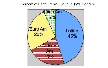
Pie charts are typically used to represent proportions or percentages of categories within a group. For example, each of the bars in the bar graph above could be converted into a circle, or "pie," and the percentages of students within each group—EP, ELL, R-FEP, etc.—who met, exceeded or did not meet standard could each be a "piece of the pie." In other words, the bar graph above could become four different pie graphs, one pie for each language group, and the "pieces of the pie" would be the proportions or percentages in each of the performance categories. However, bar charts are more commonly used to display this information. Pie charts are used more commonly to describe student characteristics – percent of various ethnic groups, or percent on free lunch, and so on.